
The Significance of Contrast
Research and Application of the Effects of Contrast
Signal Detection Theory
The human visual system has evolved to have survival purposes. Being able to spot a tiger amidst tall, golden grass is a life or death situation that depends heavily on the visual system’s ability to discern the target from its distractors. The more distractors there are, the less likely the target is detected. This phenomenon is called the set-size effect and is the result of an increase in the probability of the noise from one or more of the distractors exceeding that of the target, causing the observer to possibly choose a distractor instead of the target [1].
The set-size effect can be modeled as a signal-noise problem by a broader theory called the signal detection theory. Signal detection theory is the means to discern information-bearing signals from background noise. The theory holds that the discrimination of a signal depends on the intensity of the signal and the psychophysical state of the individual. In the case of the tiger, the signal stemming from the well-camouflaged tiger may be too weak for the individual to perceive, leaving the tiger undetected.
How to Achieve Signal Detection
The visual system is continuously processing signals from the visual field. During the early stages of the visual system process, billions of neurons work in parallel to extract features, such as the orientations of edges and colors. At this stage, the bottom-up, physical sensory processors proceed in a fairly automatic fashion [2]. Unfortunately, there is more information out in the world than the human brain can process and therefore a more selective approach is needed.
One option is to discard input. Receptors in human eyes in the periphery are spaced more widely and ganglion cell receptive fields are large for coarser sampling. Only at the fovea is the retinal image processed in full detail. The second option is to process the information selectively by conducting a limited capacity search across a smaller contained space [2]. In either case, the signal arriving to the retina from the physical world is key. The stronger the signal, the more likely the signal will reach our visual cortex the quickest and grab attention. One important component of signal strength is the presence of contrast.
What is Contrast?
Contrast is the difference from the perceptual norm. It is the difference in light between the target and the background. This relative measurement of light is what is transmitted from the eye to the brain; nothing about the physical amount of light falling onto the retina is channeled to the brain [3, P. 69]. Generally, the higher the contrast, the larger the signal strength becomes. It should be noted however, that the highest contrast does not necessarily mean the best contrast, which is suggested by the split-complementary color scheme. Ultimately, whether an individual sees something depends heavily on contrast.
Luminance
Luminance is the physical measure of the amount of light and plays a key role in determining contrast. It is one dimension of the color space (red-green, blue-yellow being the other two) and carries the most information, making it the most important dimension for human vision. Without luminance, visual perception would be impossible.
Manipulating luminance contrast can create various effects. An example of this is simultaneous brightness contrast, which is the general effect whereby a gray patch placed on a dark background appears lighter than the same patch on a lighter background. This effect can lead to errors of judgment (nearly 20%) when reading quantitative values displayed using a gray scale. Hence, it is advisable not to use gray scale to represent more than two to four numerical values [3, P. 75].
The loss of luminance contrast can have an impact on the reading rates of normally sighted readers. The reading rates of users decreased by a factor of two for a tenfold reduction in luminance contrast of text. Comparing color contrast to reading performance also showed a similar result, suggesting that color contrast also affects reading rates [4]. Furthermore, the size of the text contributes to the readability of text, especially for people with low vision; reading rates declined rapidly for very small and very large letters [5].
Brightness
Brightness is the perception of light. It is the psychological response to a physical stimulus of luminance. The human visual system is very sensitive to this stimulus; visual senses can detect about a 0.5% change in brightness, constituting brightness as a crucial channel in which information is delivered [3, P. 89]. The relationship between luminance (L) and brightness (B) can be represented by S.S. Stevens simple model, B = KL^n, where K is a constant and n is an exponent in the order of 0.33 [6]. This simple equation however only applies to lights viewed in relative isolation in the dark, such as bright LED lights on the control panel of an aircraft during nighttime [3, P. 83]. Hue, saturation, and other variables must be taken into consideration when designing for brightness.
Hue
Hue is the wavelength of light and is the color we perceive. According to the V(λ) function, humans are roughly 100 times more sensitive to yellow than to blue [3, P. 80]. Furthermore, the visual sensors are less receptive to red than to other colors such as green, yellow, or orange. Using blue colors on a black background should be avoided because the luminance difference between the two colors is minimal. Furthermore, equiluminant colors can be stressful to see because the visual system cannot perceive the edges properly. A minimum luminance contrast ratio of 3:1 is recommended [3, P. 82].
The human eye consists of three distinct color receptors called cones and light sensitive receptors called rods. The human foveal vision has higher concentration of green and red sensitive cones, but no rods, making red, green, and yellow look sharper and crisper. The peripheral vision on the other hand, has a high concentration of blue sensitive cones and luminance sensitive rods; another reason to avoid using blue for smaller, finer details in a visually competitive arena.
A characteristic that limits the effectiveness of color is that roughly 7 percent of the male population is color-blind. Most prevalent is protanopia, which is the color deficiency in the red-green channel. Another limitation is that the color vision facility of human visual sensors become less engaged under low illumination settings, particularly for red because it is not seen by rods [7, P. 73]. Although color plays a crucial role in data visualization, an important guideline is to design for monochrome first so that elements can still be seen under non-optimal conditions [8].
The Special Properties of Blue
Blue is a special hue because it is the only color that is known to have a universal meaning. It is also the hue that is least receptive to the eye. This is especially the case for the elderly. The elderly have a difficult time perceiving blue, especially in low contrast conditions, because of poor visual acuity [9]; as time progresses our eye lens, the muscles around the eye become rigid, and the eye accumulates damage from years of UV light exposure. Blue is also typically out of focus, particularly when a nearby red object is focused due to chromatic aberration [3, P. 49]. For these reasons, blue is not recommended for use in small, fine details.
Saturation
Saturation is another dimension that affects contrast. Saturation represents the purity of the color. The less saturation there is, the more washed out a color looks. An object’s perceived saturation is also determined by its surrounding. Objects appear more vivid and richly saturated against low-contrast, gray surroundings than against high-contrast, multi-colored backgrounds [10]. For large color coded areas, less saturation should be used. For example, maps should have low saturation so that smaller objects with higher saturation, such as dropped pins, can be distinctly seen [3, P. 125].
Application of Research - Scroogled.com
Scroogled.com is a website that uses high contrast to gain attention and provide a sense of alertness. With its highly saturated colors and moving arrows, it is a visual arena with almost every element fighting to grab the observer’s attention. Improvements can be made to the site to reduce fatigue and visual stress.
Red Alert
Take for example the alert message on privacy on the homepage of Scroogled. The background is a highly saturated red that consumes a large portion of the real estate on the page. It has bolded white text for the headline and uses a smaller, finer font for detailed text. The section passes the minimum contrast ratio of 3:1 with a ratio of 5.9:1 (using Colour Contrast Analyzer found here ), and works well for protanopia users who are red-green color-blind. However, the use of this particular red is fatiguing because it has extremely high signal strength, making the white text difficult to read. Additionally, the area has a high density of high contrast edges as well, which contributes to fatigue. This issue falls into the bucket of too much contrast, as users are susceptible to the phenomenon of negative afterimage [7, P. 73]. It is recommended that the background color is lowered in saturation or brightness or swapped out with a different hue altogether.

The Logo
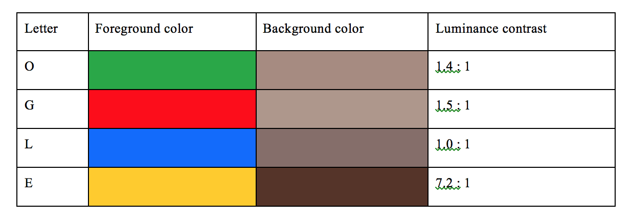
The Scroogled logo is the largest text on the page and is positioned at a prominent location. When viewed at a small enough browser width, the logo overlaps with the background image of the two individuals. Every letter overlapping the image except for the yellow ‘E’ is stressful to see because they are all roughly equiluminant with the background. The blue ‘L’ next to the red ‘G’ becomes unfocused when visual attention is turned to the red ‘G’.
Although the relative large size helps to see the logo, a number of improvements can be made. First, luminance contrast boundaries can be used to help define the large letters (Wave, p.113). Second, the opacity of the background can be dropped to increase the luminance contrast as well as the color and brightness difference.

Data Visualization
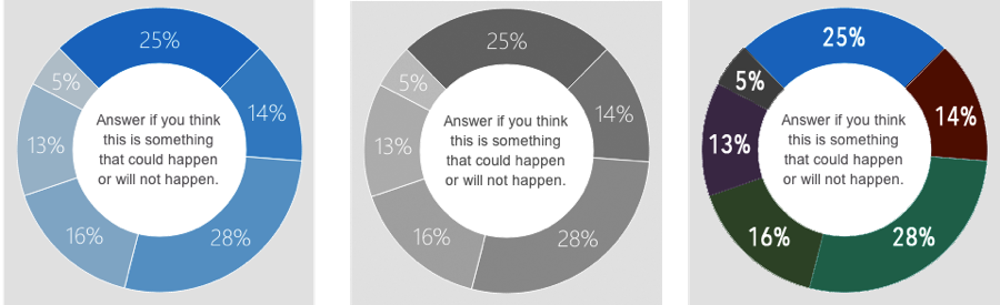
The Carnegie Mellon study explained on the “Get the Facts” page displays two charts for data visualization. One is a pie chart with each sector color-coded with different shades of blue. Those that have poor acuity, such as the elderly, will find it difficult to perceive the numbers labeled on each sector, especially for the three sectors on the left (5%, 13%, 16%). Even if the chart was designed with monochrome first as suggested by Schneiderman, the number of gray shades exceeds that of the recommended two to four numerical values [3, P. 75]. An improvement would be to use more than just one hue to color-code the pie chart in addition to using bolded text for higher contrast.
Conclusion
The visual system depends heavily on the relative signals from the visual field. The most basic component to signal strength is therefore the presence of contrast. Luminance, brightness, hue, and saturation can all be used to create contrast. As shown with Scroogled.com, the excess or lack of contrast makes elements difficult to perceive. Interfaces should be designed with the right amount of contrast for the perceived visual system.
References
- [1]E. L. Cameron, J. C. Tai, M. P. Eckstein, and M. Carrasco, “Signal detection theory applied to three visual search tasks–identification, yes/no detection and localization.,” Spatial vision, vol. 17, no. 4-5, pp. 295–325, Jan. 2004.
- [2]J. M. Wolfe, “Guided search 2.0 A revised model of visual search,” Psychonomic bulletin & review, vol. 1, no. 2, pp. 202–238, 1994.
- [3]C. Ware, Information Visualization, Third Edit. Waltham, MA: Elsevier, 2013, p. 512.
- [4]G. E. Legge, D. H. Parish, a Luebker, and L. H. Wurm, “Psychophysics of reading. XI. Comparing color contrast and luminance contrast.,” Journal of the Optical Society of America. A, Optics and image science, vol. 7, no. 10, pp. 2002–10, Oct. 1990.
- [5]G. E. Legge, G. S. Rubin, and A. Luebker, “PSYCHOPHYSICS OF READING : V . THE ROLE OF CONTRAST IN NORMAL VISION,” Vision research, vol. 27, no. 7, pp. 1165–1177, 1987.
- [6]P. Y. Ngai, “The Relationship Between Luminance Uniformity and Brightness Perception,” Journal of the Illuminating Engineering Society, vol. 29, no. 1, pp. 41–50, 2000.
- [7]C. D. Wickens, An Introduction To Human Factors Engineering, Second Edi. Upper Saddle River, NJ: Pearson Education, Inc., 2004, p. 587.
- [8]S. B. Schneiderman and C. Plaisant, Designing The User Interface, 4Th Editio. Pearson Addison Wesley, USA, 2005.
- [9]C. Owsley, R. Sekuler, and C. Boldt, “Aging and low-contrast vision: face perception.,” Investigative Ophthalmology & Visual Science, no. August, pp. 362–365, 1981.
- [10]R. O. Brown and D. I. MacLeod, “Color appearance depends on the variance of surround colors.,” Current biology : CB, vol. 7, no. 11, pp. 844–9, Nov. 1997.