
Preattentive Processing
Research and Application of the Gestalt Principles
Preattentive Processing
Preattentive processing plays an important role in human vision. An understanding of the fundamental mechanism in which preattentive processing occurs allows designers to design displays with increased quality and quantity of information. When patterns or groups are identified before conscious attention is directed, preattentive processing is said to have occurred. This suggests that processing occurs in a rapid, parallel fashion across the visual field [1]. Typically, the time it takes for a preattentive task to complete is within 200 to 250ms, and this is accomplished with minimal effort [2]. These features are said to have a ‘pop-out’ effect [3, P. 153]. Examples of preattentively processed features that exhibit said effect include shape, color, and proximity.
The Importance of Preattentive Processing
Preattentive processing is important in many regards. From a neural network perspective, the ability to decompose, group, and compress the physical signals received by the retina is driven by efficiency. This is because human attention has only a meager capacity [4]. From a design perspective, it is often useful to be able to show information ‘at a glance’. If a mark on a map is required to be instantaneously identified of belonging to a certain type, it should be differentiated from all other marks in a preattentive manner [3, P. 154]. Furthermore, preattentive processing is crucial in organizing the information-dense field of vision as a whole.
Gestalt Laws
Gestalt laws provide a clear description of many basic perceptual phenomena of pattern recognition. According to Koffka, the laws explain how individual elements may be visually organized into structures [5]. These psychological principles have influenced many research areas since 1924, including visual screen design [6]. However, the German psychologists behind the gestalt laws were simply observers; the laws relied heavily on phenomenology and did not sufficiently support their principles with objective data [7]. Although their neurological explanations for these laws have been debunked, the robust laws themselves have withstood the test of time.
Proximity
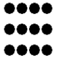
One of the major gestalt laws of organizing the visual field is the grouping of stimuli on the basis of proximity. The law simply states that objects that are close together are grouped together. This is alternatively called the spatial concentration principle [8]. By spatially grouping elements, less time is spent with eye movement and neural processing because information is picked up more readily in foveal vision [3, P. 181]. According to this law three rows of four black circles are seen in figure 1.
The gestalt psychologists never demonstrated whether it is the physical proximal stimuli on the retina, or the perceived proximity that governs this principle [9]. Later research effectively showed that proximal grouping can in fact be driven purely from a bottom-up, preattentive process, as demonstrated by Compton & Logan’s modifed version of the van Oeffelen and Vos’s code algorithm [10]. When proximity is the sole differentiating feature, the gestalt law of proximity stands; objects that are clustered together are grouped. Making design decisions based simply on visual aesthetics or “what looks good” should never supersede this principle. A common design practice therefore is to place symbols representing related information close together.
Similarity
The gestalt law of similarity state that objects that are similar in features such as color, orientation, and shape, are grouped together. Koffka demonstrated that grouping by shape is stronger than grouping by color by contrasting the effectiveness of each similarity feature to that of proximity. Even when color and shape similarity is not in competition with proximity grouping, grouping by shape similarity had a stronger effect [5].
It would of course be a mistake to conclude that one principle is invariably stronger than the other. More recent research has demonstrated that grouping of common color is actually more powerful than grouping by common shape. Examination of similarity and proximity showed persuasive evidence that under certain conditions, both common color and shape were shown to override grouping by proximity [11]. What this seems to suggest is that there is an intimate relationship between the features of similarity (color, shape) and proximity, and that it is important to consider the effects of each individual effect, and its conjoint effect when making design decisions. This is especially the case when designing grid layouts of a data set; the use of low-level visual similarity channel properties such as color are recommended [3, P. 182].
Similarity and Proximity
When the proximity feature is conjoined with other features, there are cases where the principle breaks down. For example, in the figure 2, the proximity principle predicts grouping into columns, yet for some, rows of dots are seen; the row-column perception seems to fluctuate. This is because the proximity and similarity principles are acting in opposition.
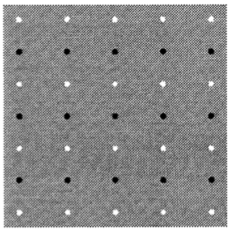
For simple dot lattice patterns, Kubovy & Holcombe has shown that the relationship is a decaying exponential function. Additionally, they have found that the features have an additive property; the overall effect is the sum of each individual effect [12]. Unfortunately, to generalize their findings, strength functions for more complex feature patterns must be discovered [7]. This example has shown that specific types of redundant coding can lead to a decrease in visual search performance for certain elements [3, P. 160].
Orientation
Another similarity feature that is worth discussing is the feature of orientation. Orientation is one of the basic features processed at the first, parallel processing stage. When exploring the manner in which orientation controls perceptual grouping, Beck found that “differences in line orientation could be as effective as differences in brightness in segregating two groups of elements” [13]. Furthermore, Beck has shown that line orientations are more readily grouped if the direction of the component lines is 45 or 135 degrees, and that vertical and horizontal lines do not readily facilitate grouping.
This seems to correlate with the visual system’s physical structure; according to the Gabor model of V1 receptive fields, V1 neurons have an orientation tuning of at least 30 degrees [3, P. 204]. Thus symbol and glyph element orientations should be separated by at least 30 degrees (and optimally, 45 degrees) for a texture field to be distinct from an adjacent texture field.
Closure and Common Region
A common region is a terminology used by Palmer to describe the region within an enclosed contour, and is a stronger organizing principle than proximity [14]. Ware explains, “when a closed contour is seen, there is a strong perceptual tendency to divide regions of space into inside or outside the contour” [3, P. 186]. Essentially, elements within a common region or a closure are grouped together. This occurs regardless of the number of elements contained within it [15] and can be “dominated by the smallest background area” [14].
Redundant Coding
Redundant coding, that is, adding visual redundancy to elements, can lead to a decrease in visual search performance for certain elements [3, P. 160], as seen above in figure 2. This is because conjunction searches are generally not preattentive, although some combinations of features have been proven to be preattentive, such as luminance and shape [3, P. 161]. Feature Integration Theory explains the difference between disjunctive and conjunctive search [16].
Feature Integration Theory
Feature Integration Theory (FIT) is a theory that seeks to explain the phenomena of preattentive processing [16]. According to the theory, the perceptual system is divided into separate maps, each of which records the presence of different visual features and the location of the features it represents. Looking for a target that differs from its distractors by a single factor, such as shape, requires consulting of a single feature map. However for conjunctive search, focal attention must be give to combine and compare multiple features maps. This joint search is what causes conjunctive search to be inefficient [17, P. 132]. Observers may also report illusory conjunctions when the brain fails to combine and compare maps, perhaps due to attentional overload [18].
Application of Research: Rio 2016
The Rio 2016 Olympic website was analyzed and reviewed based on the principles of proximity, similarity, and common region. The site is not a time-sensitive site, but is nevertheless densely packed with information. The site’s aim to excite, inspire, and spread the knowledge of Rio is done through a mixture of text and graphics, all organized using vibrant colors, lines, white space, and shapes. It is critical for the website to display these information in proper structure.
Proximity
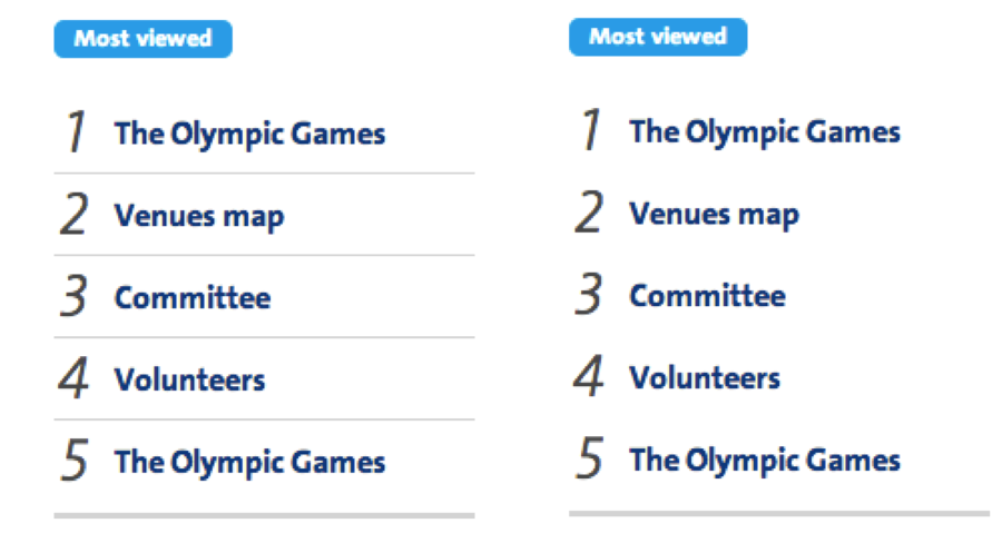
The sections of the homepage under the main banner are grouped together using proximity. In general, photo images that are spatially close to corresponding text are clustered as a whole. An example of this is the “News”, “Interview”, and “Rio de Janeiro” section. The numbered list under the “Most Viewed” section is also identified as a block due to close proximity and alignment. In fact, the border between each list item can be removed to reduce redundancy (Figure 3).
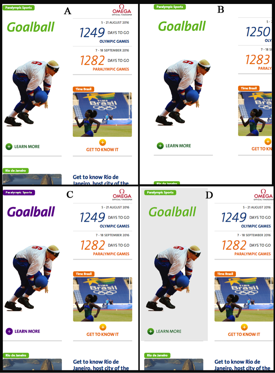
Each individual section is grouped using white space, albeit not in an optimal fashion. Take for example, the goalball player under the “Paralympic Sports” section. Based on proximity, the player is falsely associated with the “Time Brasil” section, especially considering similarity in skin tone and the orange color-coding of the “Time Brasil” section. The “Learn More” call to action button is equidistant from the goalball player and the “Rio de Janeiro” section tag, yet the button is related to the latter, again, due to similarities in color. This supports Quinlan & Wilton’s stance that color similarity overrides proximity. An adjustment in the distance between each section is recommended to clearly separate out blocks of elements. Alternatively, a different color, or a common background can be used, although redundant coding should be avoided.
Similarity
Each individual section on the homepage is color coded in hues of orange, green, or blue. It is easy to differentiate between the “Olympic Sports” section in green and the “Time Brasil” section in orange. Shape similarity is also used to group section headings, although its strength is weakened by color similarity and lack of proximity.
The countdown days can spark confusion. The law of proximity states that the two countdown numbers go together, yet color similarity yields different groupings; the Paralympic countdown is correctly bucketed with the “Time Brasil” section below, but the Olympic countdown is perhaps grouped with “Interviews” because of matching text color (blue). This is similar to the fluctuation problem seen in figure 2. A solution would be to color code both countdowns to be the same (orange).

Closure and Common Region
The site takes use of closure and common region to group elements on the page. The “Photos” and “News” sections are separated out from the rest of the sections because it has a common background of gray. Proximity would state that the “Photos” header and headline are separated from the group of photos near it, yet they are perceptually labeled as a single group. This supports the notion that common region is a much more powerful feature than proximity or similarity as demonstrated by Palmer [14]. The “Rio 2016 and You” footer section at the bottom of the homepage exhibits the same grouping mechanism. Sections within the footer section are split based on closure, although the enclosing line itself is only part present.
Conclusion
Preattentive processing is an important component of the visual system. As illustrated with Rio 2016 Olympic website, the gestalt principles of proximity, similarity, closure and common region can be used to easily capture information ‘at a glance’. Confusion can ensue, if the improper feature, or a combination of features, is applied. Designers should be aware of these principles to help organize the visual field without directed, conscious attention.
References
- [1]A. Treisman, “Preattentive Processing in Vision,” Computer vision, graphics, and image processing, 1985.
- [2]C. G. Healey, K. S. Booth, and J. T. Enns, “Harnessing preattentive processes for multivariate data visualization,” Graphics Interface, 1993.
- [3]C. Ware, Information Visualization, Third Edit. Waltham, MA: Elsevier, 2013, p. 512.
- [4]L. Zhaoping and P. Dayan, “Pre-attentive visual selection.,” Neural networks : the official journal of the International Neural Network Society, vol. 19, no. 9, pp. 1437–9, Nov. 2006.
- [5]K. Koffka, “Principles of Gestalt psychology,” pp. 1–14, 1935.
- [6]D. Chang, L. Dooley, and J. E. Tuovinen, “Gestalt Theory in Visual Screen Design — A New Look at an old subject,” \ldots of the Seventh world conference on \ldots, 2002.
- [7]M. Kubovy, A. O. Holcombe, and J. Wagemans, “On the Lawfulness of Grouping by Proximity,” Cognitive psychology, vol. 98, no. 35, pp. 71–98, 1998.
- [8]T. A. Slocum, “Predicting visual clusters on graduated circle maps,” Cartography and Geographic Information Science, vol. 10, no. 1, pp. 59–72, 1983.
- [9]I. Rock and L. Brosgole, “Grouping Based on Phenomenal Proximity.,” Journal of experimental psychology, vol. 67, no. 6, pp. 531–8, Jun. 1964.
- [10]B. J. Compton and G. D. Logan, “Evaluating a computational model of perceptual grouping by proximity.,” Perception & psychophysics, vol. 53, no. 4, pp. 403–21, Apr. 1993.
- [11]P. T. Quinlan and R. N. Wilton, “Grouping by proximity or similarity? Competition between the Gestalt principles in vision,” Perception, vol. 27, no. 4, pp. 417–430, 1998.
- [12]M. Kubovy and M. van den Berg, “The whole is equal to the sum of its parts: a probabilistic model of grouping by proximity and similarity in regular patterns.,” Psychological review, vol. 115, no. 1, pp. 131–54, Jan. 2008.
- [13]J. Beck, “Perceptual grouping produced by line figures,” Perception & Psychophysics, vol. 2, no. 11, pp. 491–495, Nov. 1967.
- [14]S. E. Palmer, “Common Region: A new principle of perceptual grouping,” Cognitive psychology, vol. 24, no. 3, pp. 436–447, 1992.
- [15]N. Donnelly, G. W. Humphreys, and M. J. Riddoch, “Parallel computation of primitive shape descriptions,” Journal of Experimental Psychology: Human Perception and Performance, vol. 17, no. 2, p. 561, 1991.
- [16]a M. Treisman and G. Gelade, “A feature-integration theory of attention.,” Cognitive psychology, vol. 12, no. 1, pp. 97–136, Jan. 1980.
- [17]E. E. Smith and S. M. Kosslyn, No Title. Prentice Hall, Inc, 2007, p. 610.
- [18]a Treisman, “Perceptual grouping and attention in visual search for features and for objects.,” Journal of experimental psychology. Human perception and performance, vol. 8, no. 2, pp. 194–214, Apr. 1982.